Vesto Design Library
As we set out to redesign the Optimus app, we saw an opportunity to address one of the major pain points in the previous version: visual inconsistencies. To solve this, we created the Vesto Design Library — a unified design system used across both the mobile and web apps to ensure consistency and scalability.
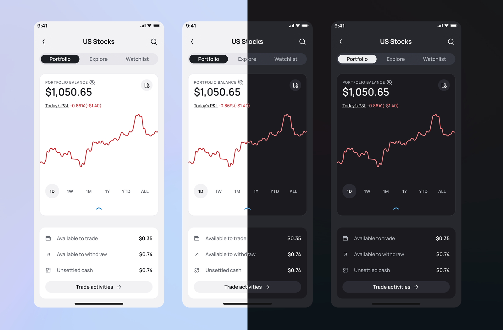
Improved Accessibility — Day and Night Mode
To better serve our customers, one of the most frequently requested features was dark mode. With the Vesto Design Library, we incorporated this functionality using design tokens, making it easy to switch between light and dark themes without compromising visual coherence.
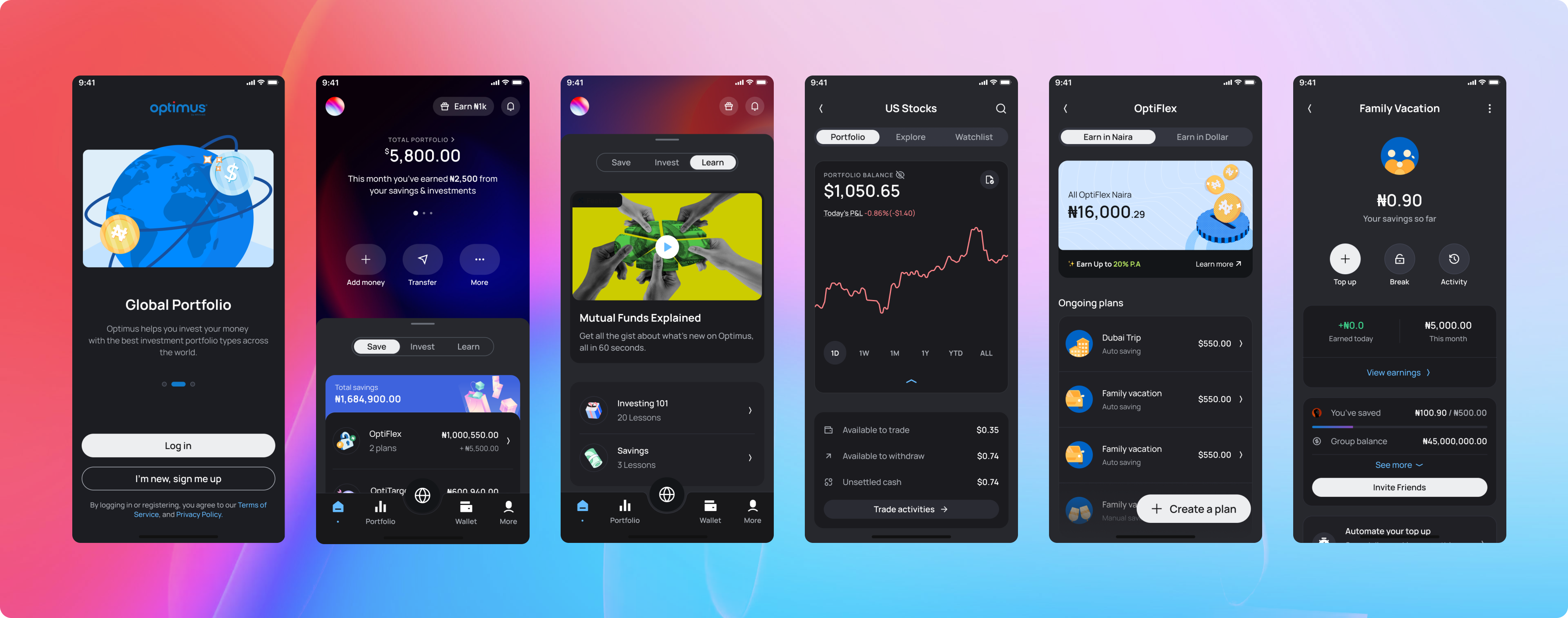
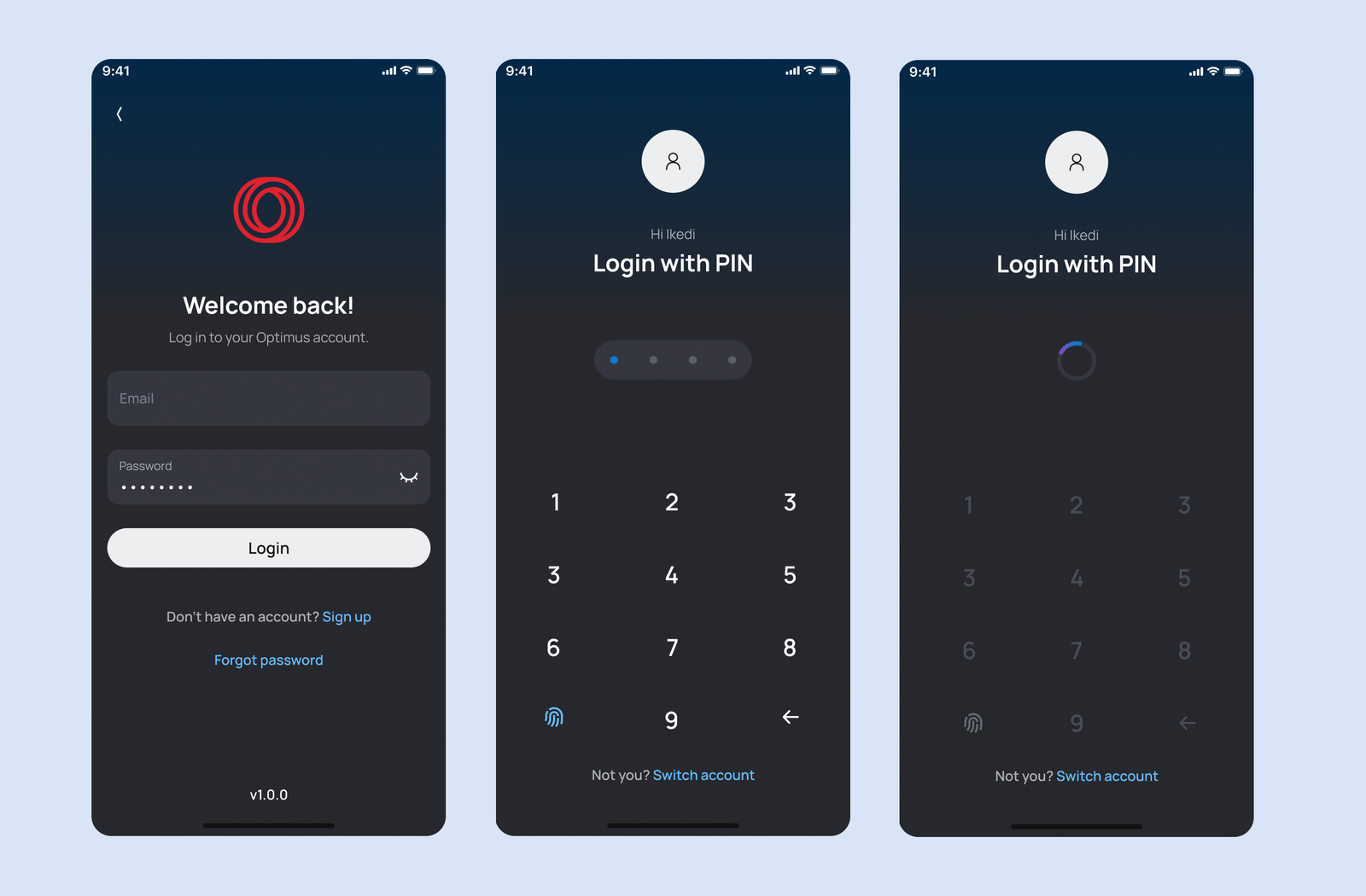
Refined User Onboarding and Authentication
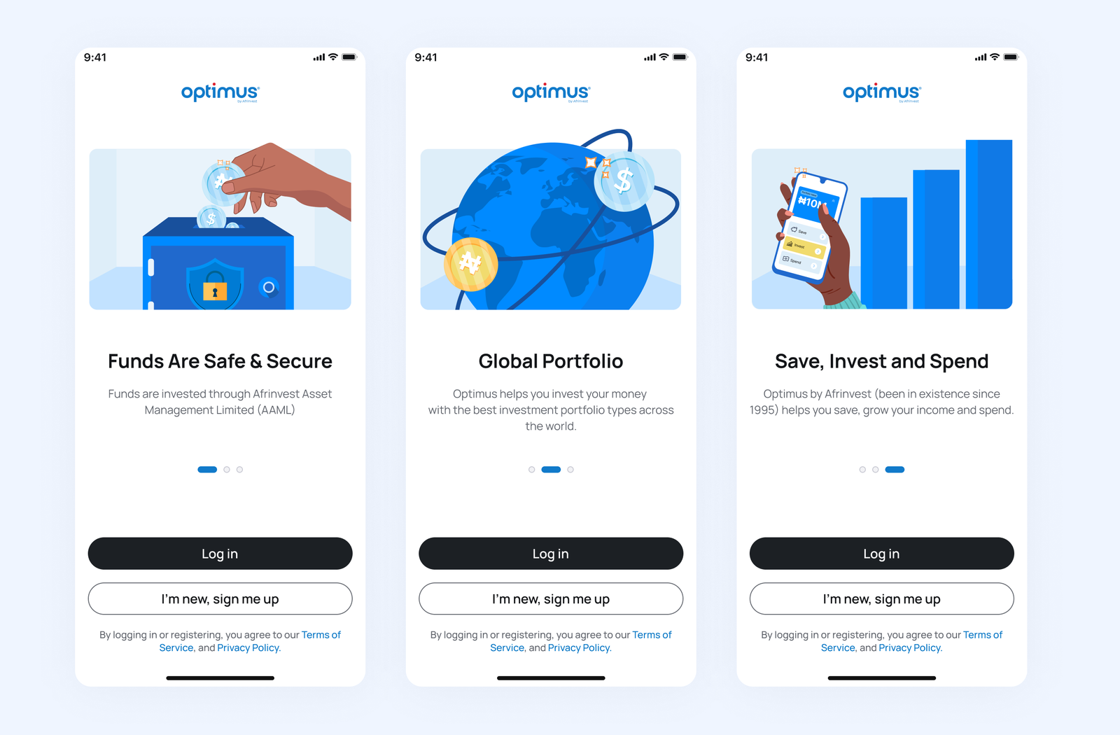
We introduced custom, on-brand illustrations for the product walkthrough to enhance the first-time user experience. These illustrations were extended to other parts of the app, giving it a distinct and cohesive visual identity.
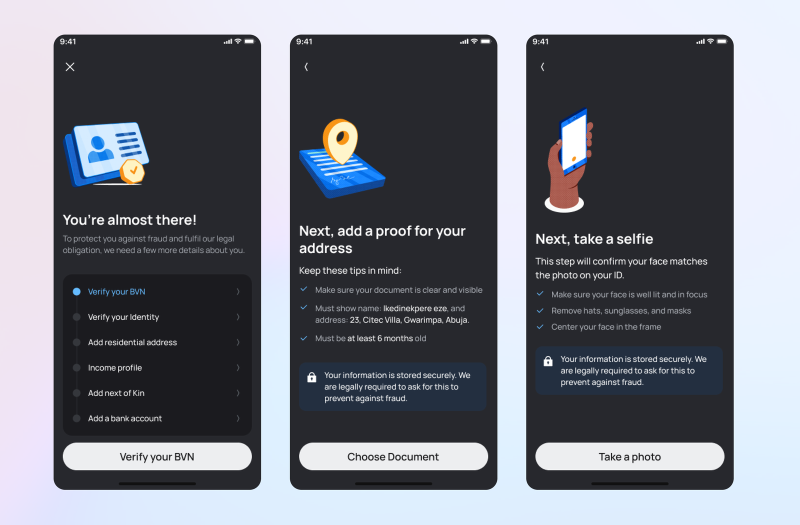
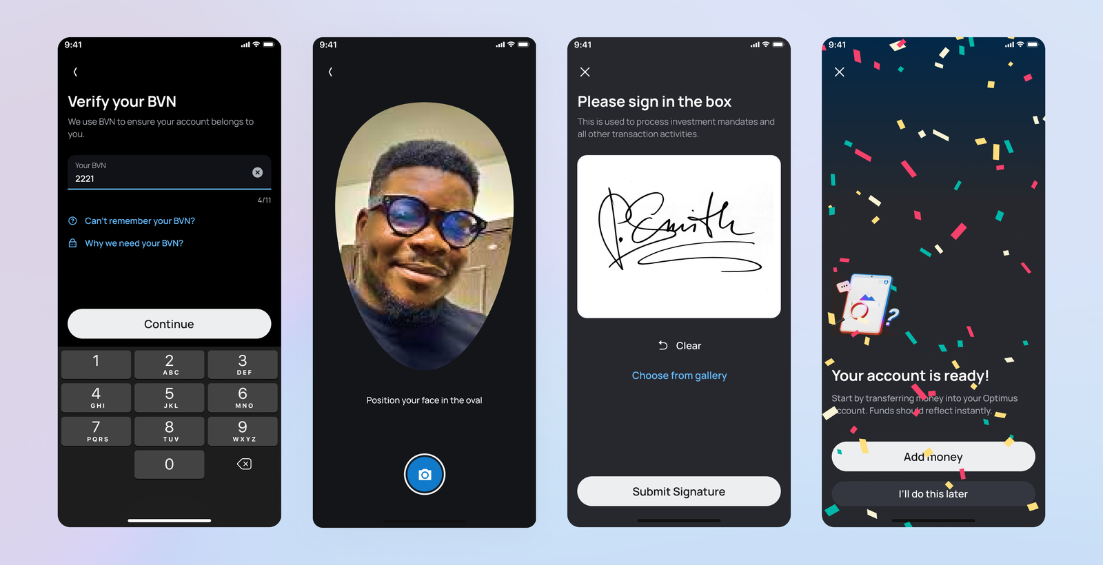
Smarter Know Your Customer (KYC)
Our previous reliance on third-party KYC providers led to frequent onboarding issues. With Optimus 2.0, we introduced a smarter, AI-powered solution using OpenAI technology to match a user's photo with the image on their submitted ID. This improved accuracy and reduced friction during verification.
A More Inclusive Dashboard
Optimus 1.0, while functional, wasn't designed to scale with the introduction of new product verticals. We solved this by introducing tabbed categorisation for savings, investments, and learning products. We also added shortcuts to key actions like adding or transferring funds, prioritised based on user behaviour data.
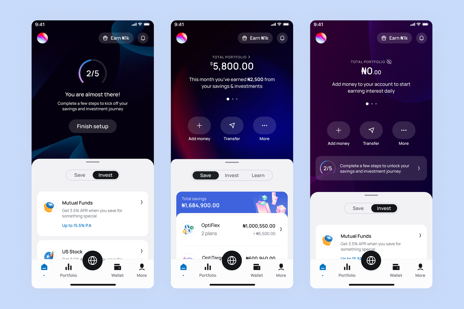
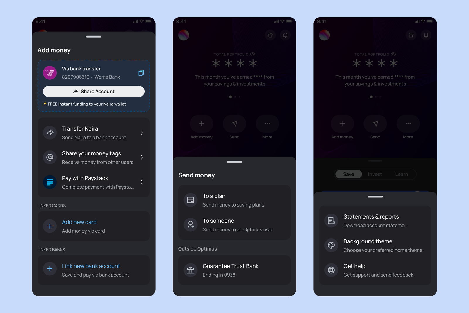
Easy Access to Key Features
The redesigned dashboard now includes clear, prominent action buttons for funding options, sending money, accessing settings, and getting help, making it easier for users to access essential functions quickly.
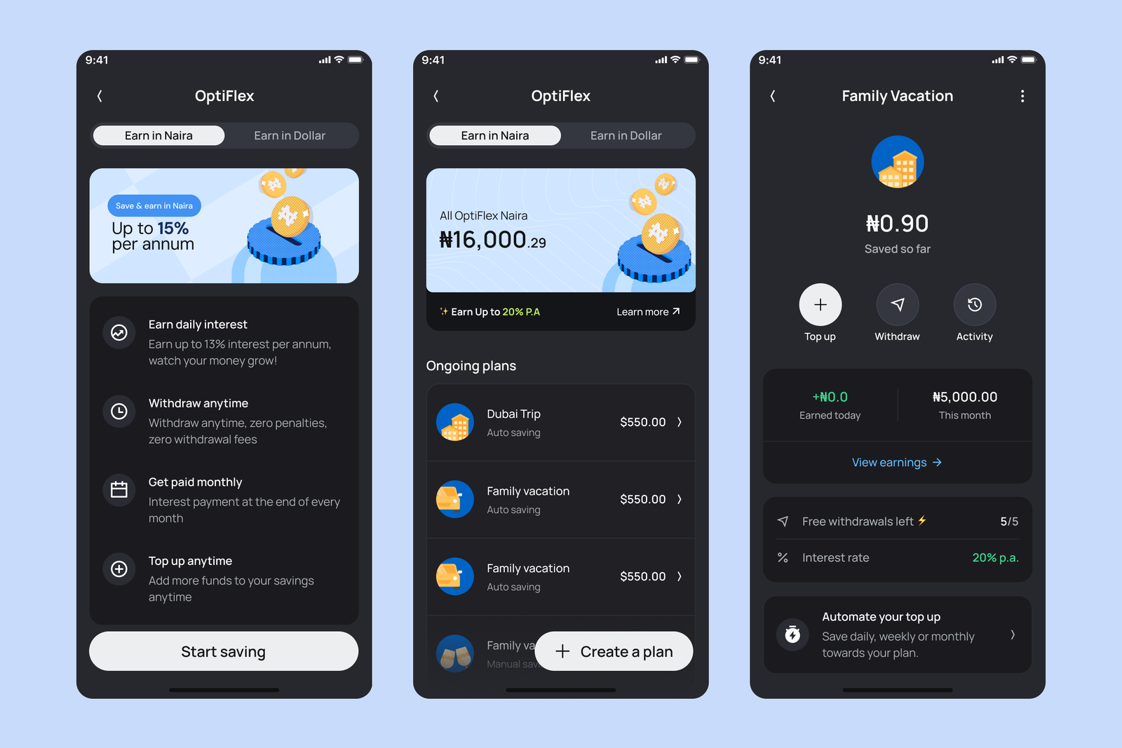
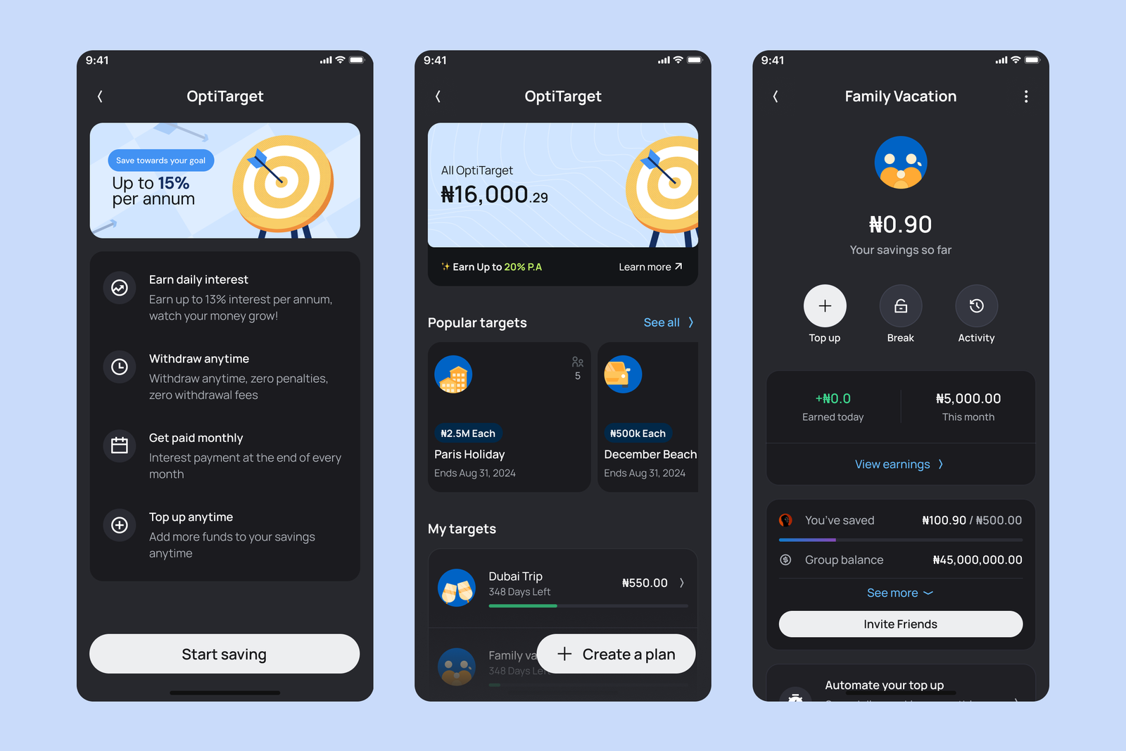
A Unified Savings Visualisation
We streamlined the user experience for our savings products — OptiFlex, OptiLock, and OptiTarget — by introducing a unified flow and visual presentation. This consistency across similar products improves engagement and usability.
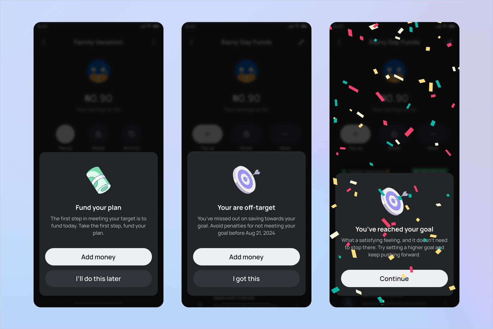
OptiTarget — Group Savings
With Optimus 2.0, we introduced OptiTarget — a savings product that allows users to set personal or group goals and earn attractive interest. Group savings foster accountability and encourage disciplined financial habits.
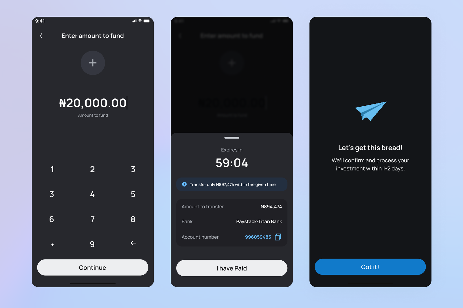
Fund with a Temporary Account Number
To provide more flexibility in funding, users can now generate a temporary account number for one-time transfers. This feature enables instant deposits to their Optimus account within a designated time window.
Fund with a Linked Bank
Users can link their existing bank accounts to Optimus to authorise direct debits for savings and investments. This secure integration, powered by Paystack, enables automated savings and reduces the overhead costs associated with card payments.
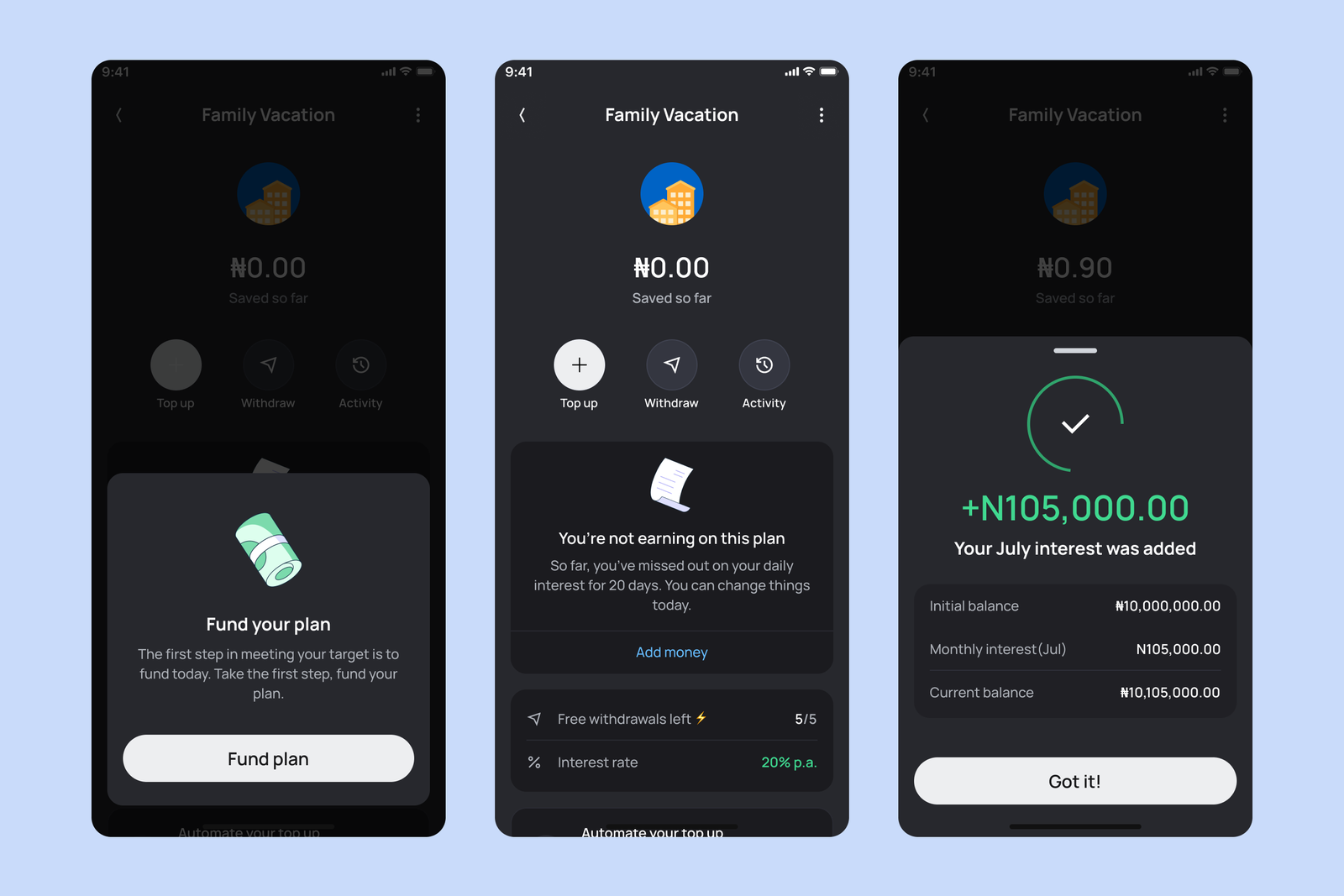
Transparent Earnings Tracking
A recurring concern has been the lack of clarity around interest earnings. To address this, we introduced an earnings trail for all savings products. Users can now view interest accrued by month and year, ensuring full transparency.
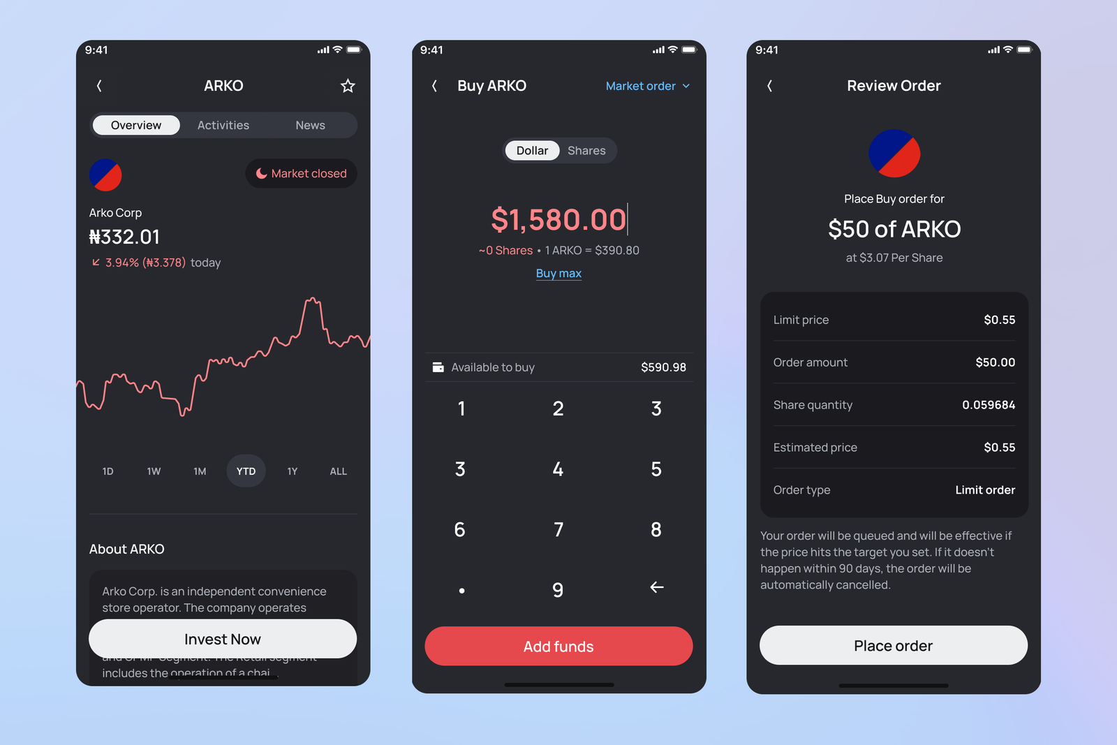
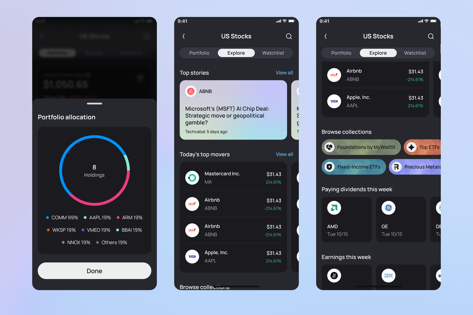
Enhanced US Stock Trading
We significantly improved the US stock trading experience with better visibility of trading wallets, easier stock discovery, and a streamlined buying and selling flow.
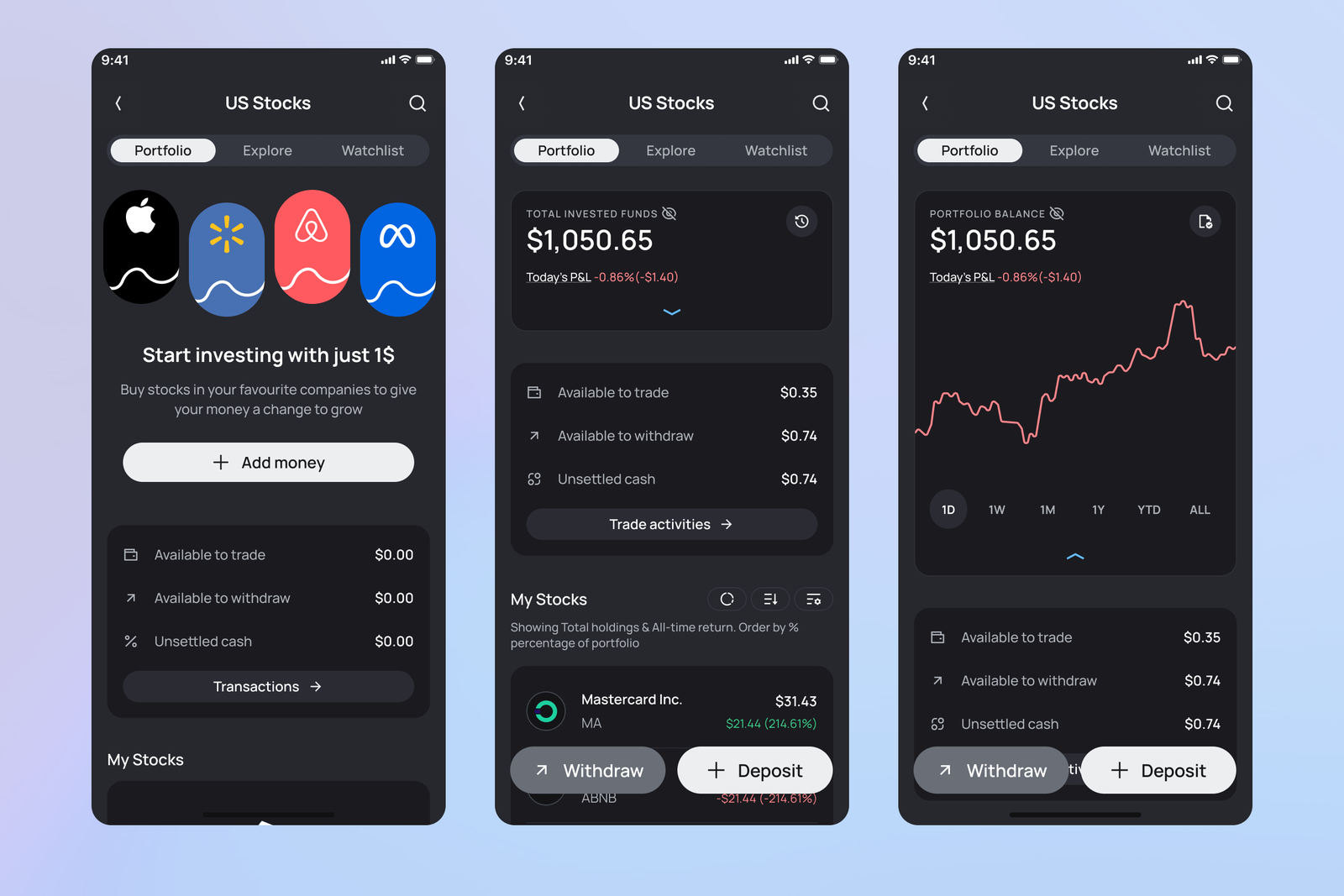
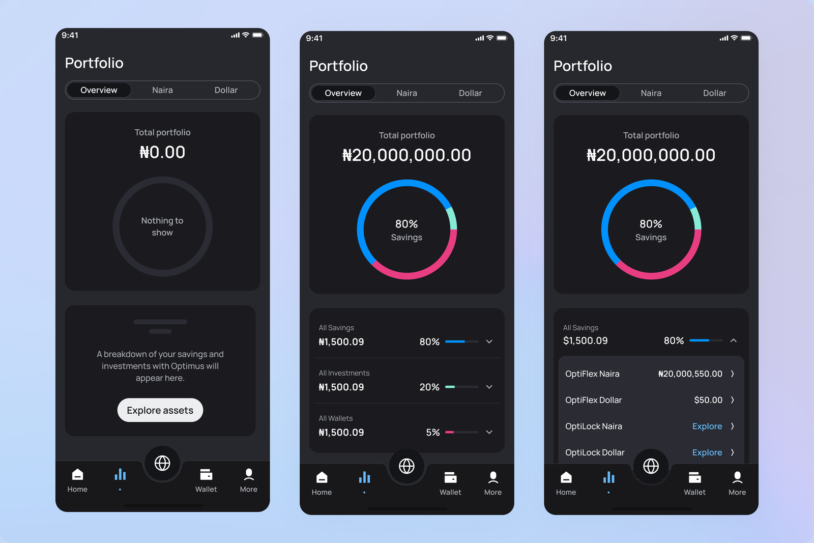
Detailed Portfolio Outlook
We redesigned the portfolio view from the ground up, offering a clear, categorised breakdown of user savings and investments in both Naira and USD. This makes it easier to understand financial performance at a glance.
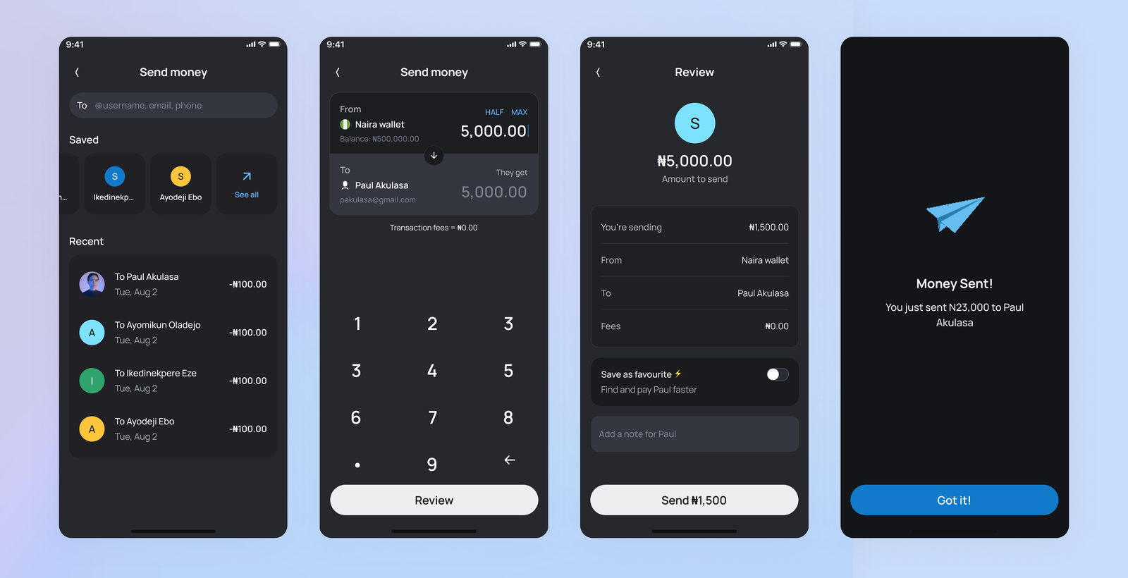
Peer-to-Peer Money Transfer
One of the most requested features has been peer-to-peer transfers. The new wallet-to-wallet system allows users to securely send money to others using a username, phone number, or email address.
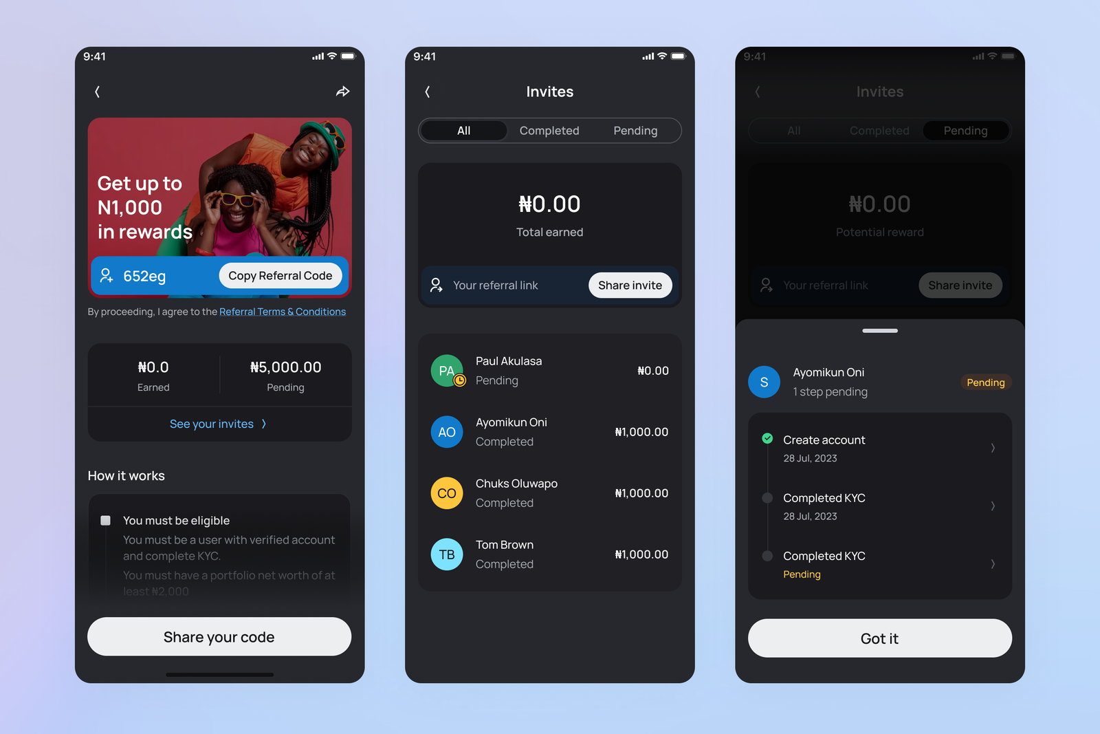
Referral Programme Visibility
Our referral programme has been a key growth driver. In Optimus 2.0, we gave it prominent placement on the dashboard and introduced a tracking feature that shows the progress of each invitee. This encourages users to follow up and assist their referrals through the onboarding process.
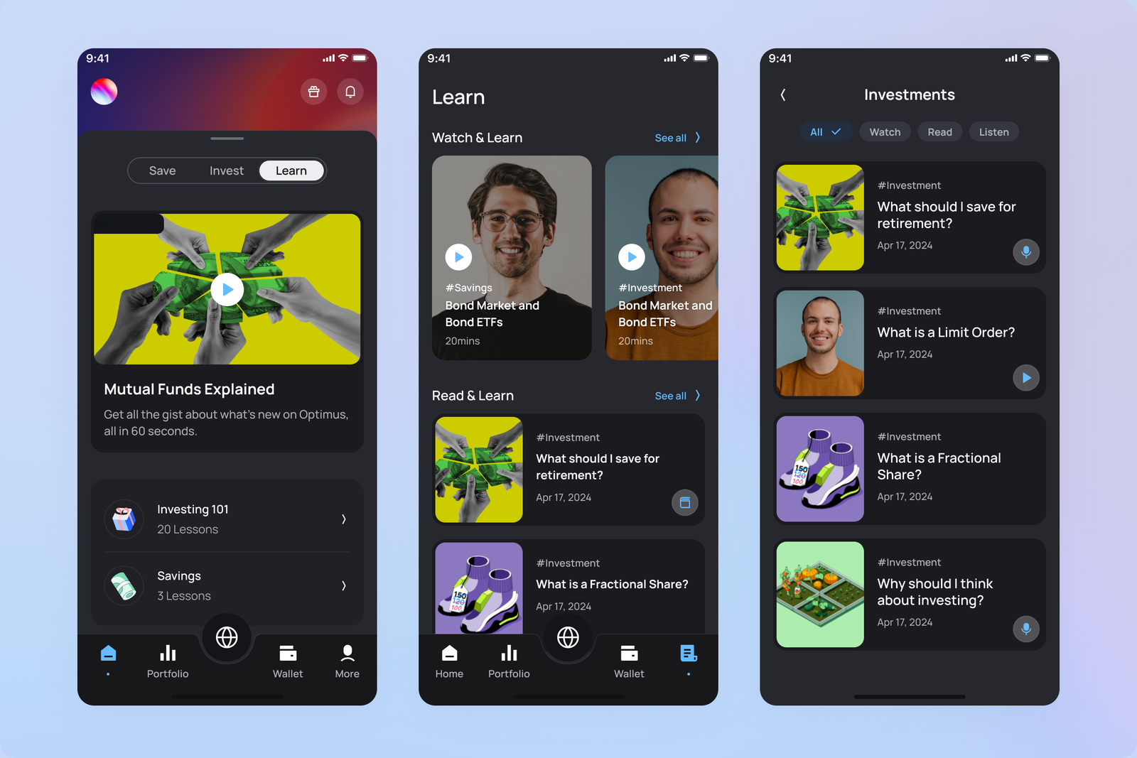
Optimus Learn
Financial literacy remains central to our mission. With Optimus 2.0, we integrated our educational resources directly into the app. This allows users to access curated investment content previously shared on social media. It also serves as a content marketing strategy to drive awareness and deepen user engagement.