Madison: a bolder face for a technology consultancy

Madison is a Lagos technology consultancy that helps companies adopt AI, cloud, and cybersecurity. The old site read like a brochure and buried the one thing that mattered, what the team could actually do for you. The brief was simple to say and hard to do: make a serious enterprise partner feel modern and confident without going cold or generic.

I led the redesign end to end, from the art direction and voice down to the responsive layout. The goal was a site that sounds like it has a point of view and looks like a team you would trust with your infrastructure.

Role Designer
Platform Marketing Website
Owner Madison, Lagos
Contributions
Art Direction Visual Design Web Design Copy Responsive Layout
Madison homepage hero: bold headline over a warm office photo, tinted deep maroon, with partner logos along the base
The direction

Attitude, built on what the brand already owned

The brand already had two strong assets: a woven diamond mark and a deep, confident maroon. I made those the spine of the whole system rather than decoration. Warm human photography carries the emotion, a heavy grotesk display carries the confidence, and the maroon ties the enterprise photography and the playful moments into one voice. The result feels premium and human at the same time, which is exactly the line an enterprise partner has to walk.


A service list you can actually scan

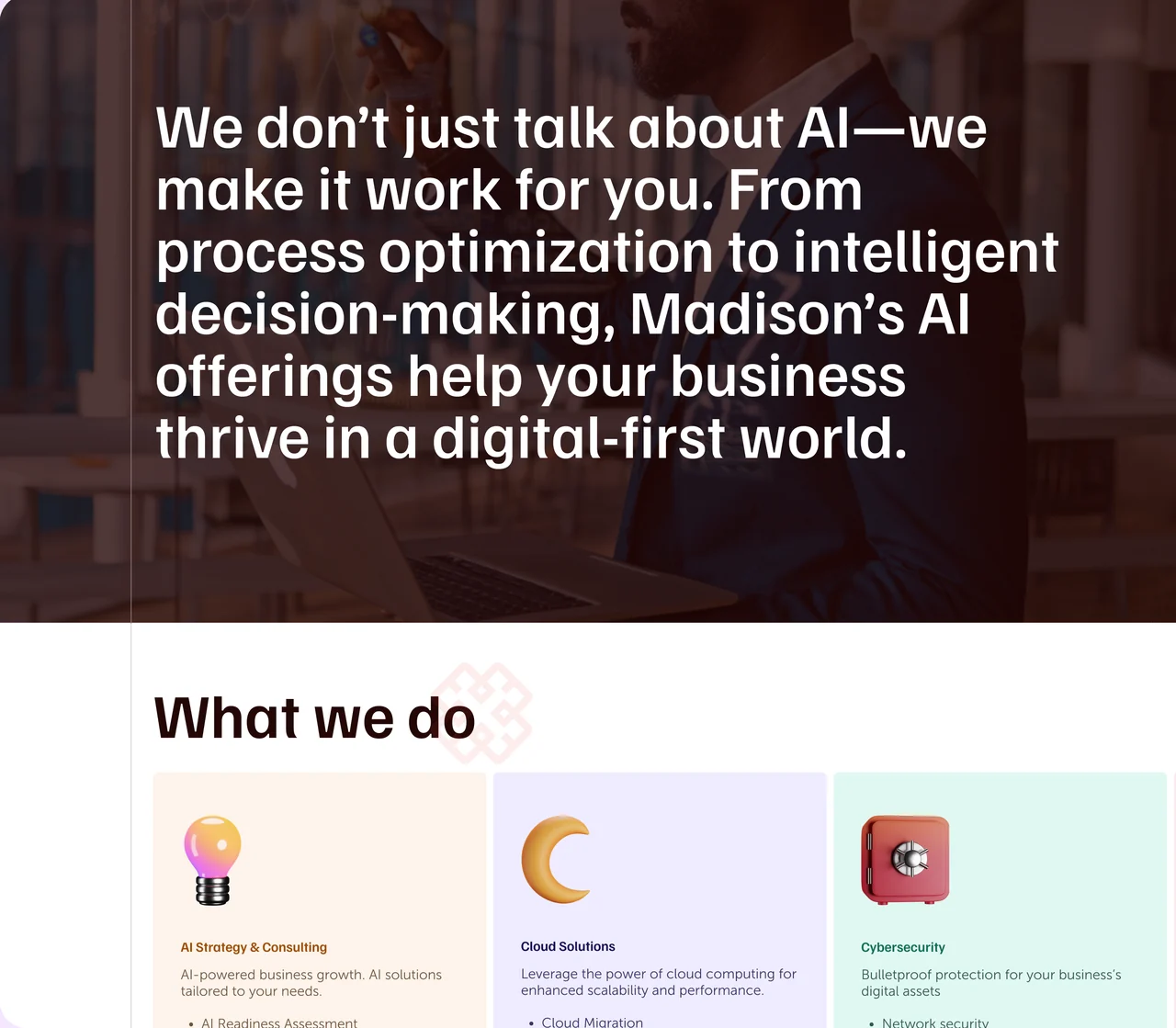
Consultancies love to bury their offer in dense paragraphs. I did the opposite. A single bold statement frames the AI work in plain language, then the services break into scannable cards, AI strategy, cloud, cybersecurity, and data, each with a playful three dimensional icon that softens an otherwise technical shelf. You can read the whole capability in a glance, then dig into any one card that fits your problem.

Madison services: a bold AI statement over a photo, above a What we do row of pastel service cards with 3D icons

Proof, in a client's own words

Enterprise buyers trust other buyers. A testimonial carousel puts clients front and centre, with a face, a name, and a sentence that speaks to outcomes rather than features. The copy I wrote for the placeholders sets the tone the real quotes should hit.

“Madison didn’t just upgrade our IT—they transformed our entire business model.” Sample testimonial from the redesign

The same energy on a phone

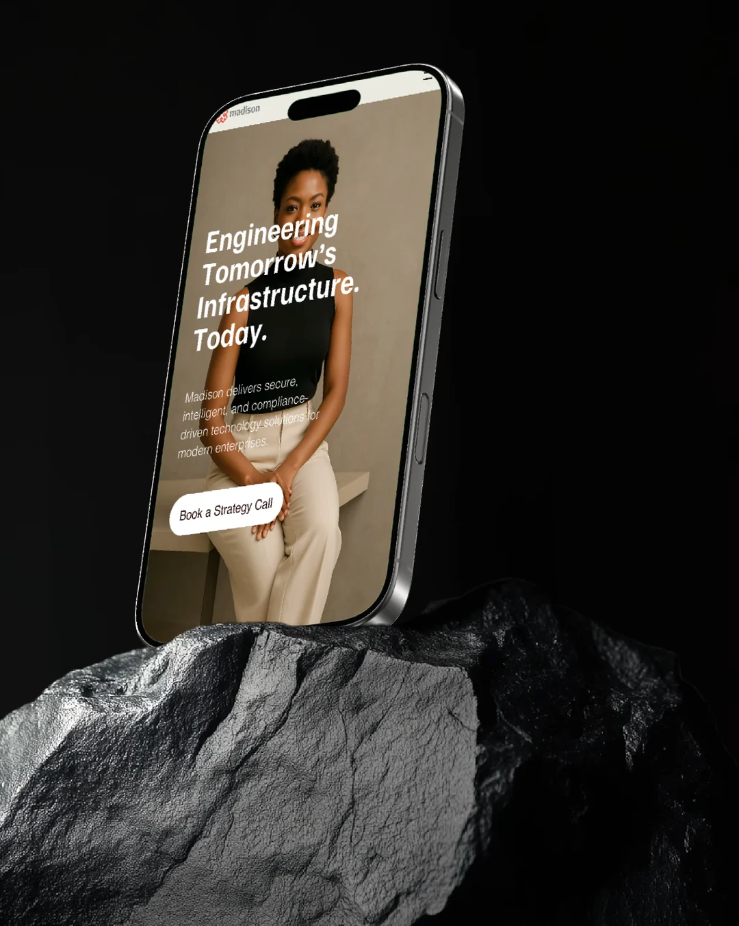
Most of the traffic arrives on mobile, so the bold type and warm photography had to survive the shrink. On small screens the headline stacks and leans into the imagery, the copy stays short, and a single clear action, book a strategy call, does the heavy lifting. Same confidence, one thumb away.

Madison mobile homepage on a phone resting on dark rock: headline Engineering Tomorrow's Infrastructure Today with a Book a Strategy Call button

Consistent all the way down

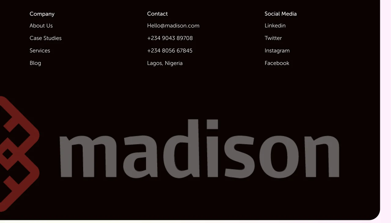
The system holds to the very bottom of the page. The footer carries the same maroon and black, keeps navigation and contact tidy in three columns, and lets the woven mark sign off at full scale. A visitor who scrolls the whole way leaves with the logo burned in.

Madison footer: Company, Contact, and Social Media columns on black with the large madison wordmark and diamond logo

Outcome

The redesign gives Madison a face that matches its ambition: bold where it needs to be loud, warm where it needs to be trusted, and consistent from the hero to the footer. It reframes a technical consultancy as a partner you would actually want to talk to.

View the full redesign on Contra ↗